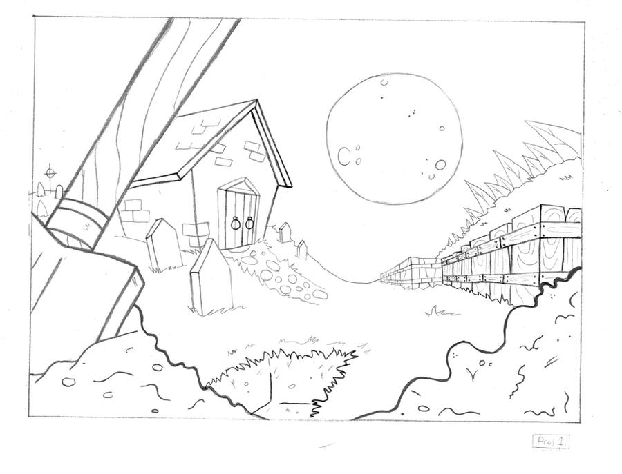
I'm re-taking layout this term, this is the first layout I've done, the subject being that of a Graveyard in the 1700s.
This is the uncoloured version. I'm going to add in some more texture, and do some tonals, and then we'll be painting it in our BG Painting class.
It's a lot bigger than this, but I re-sized it on the computer. So if you click it, it gets bigger.
These are the characters I made up for my Graveyard layout. The plan is, the grave robber gets spooked by the ghost.
Simple, no?Just for an animation exercise. I made a character similar to the grave robber this last year, but this version is much better.
Here we have an updated and revised version of the layout, made prettier.
And here's a tonal I did up.
That's all for now.


1 comment:
I like this. Very nice!
Post a Comment